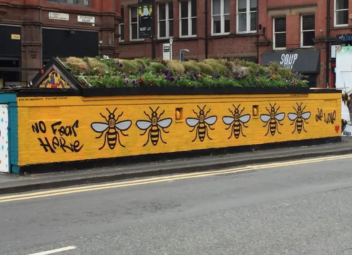
Manchester's bee has been the city's logo for over 100 years now. If you ask anyone about Manchester, they’ll probably mention it as the London of the North, a good night out (I see you 42’s), and most importantly, the bee. This Northern Design Writer recently moved to Manchester, and as a bee enthusiast, it made me think—why is this design so effective?

A multilayered symbol
The actual origin of the bee is a little murky and a long story for another day, but if you are interested, this article does a wonderful job of summarising the story. Manchester city council states that the bee shows the hard work ethic of Manchester and represents the city as a hive of activity. Although this analysis does sum it up pretty well, there’s something more to it. Much like the fuzzy little creatures who have an excellent PR team, there’s something more intricate than the basic symbolism, but this cannot go understated.
Bees are known for their colonies, their teamwork, and their hives. Everyone knows the worker bees provide for the queen, they leave the hive, they return, and the day goes on. The beauty of this can be found in the branding—the bee network. We leave our homes, we go to work, we come home again. Yes, people do drive, but your average worker in Manchester is grabbing the bus or the tram. They are, for lack of a better term, a worker bee. Isn’t that wonderful? The people of Manchester live in this hive of activity, and they travel around just like bees, returning home on their bee-inspired vehicles, it all makes sense. The design was simple and effective- people belonged to it.

Identity in design
But there’s something more personal to this design than ever intended. When we think of ourselves we are the main character. But what if we weren’t? This is where the brilliance of the design sinks in. There’s only one queen bee, and yes, many people may believe it's them. I’m sure many of us would even joke ‘this is my city’ and everyone else works around us. Yet, this is the joke, because the bee forces us to admit this isn’t true. But, it does more than make us say we’re not the queen, it makes us okay with that.
No one sees a bee and walks past because it's just a worker bee. People stop and they take it in, they take a picture, they tell their friends. It’s exciting to see a bee because it means summer is coming and winter is ending. So what if we are the bee? By uniting Manchester as a hive, we’re forced to look at and respect the people around us. We’re all living our lives and it makes us painfully aware of it. The person reading on your tram, or stood on the stairs of the bus. They’re living their own life, and they have a purpose. They know people you never will, and it’s sad and beautiful because what if you said hello? We take out sugar and water on a spoon for a bee on the ground, what if you held the door for the person running for the elevator? The generosity we provide for these creatures becomes innate to our own lives, and effectively to each other. If we’re all bees, why don’t we look out for each other more the way we do for them?

The bee symbol creates an undeniable community that looks out for each other. Everyone is on their own path, working towards their own, and why not help them with a smile along the way? It takes a village to raise someone, and by rallying the people together under this symbol it perpetuates the care we need to carry for each other more than ever. So much so that in the tragedy of the 2017 Manchester Arena bombing, the bee became the symbol of solidarity worldwide. The logo took on a new life of hope; it was a beacon of support, a statement of unity. It was a design never intended to front for a tragedy, but it did because the community it upholds was needed then more than ever.
You might want to say you’re reading too much into it; it’s just a bee. And to that, I'd tell you to open your eyes. There is compassion in design and compassion in the world. Only by looking do we truly realise the capabilities of the designs we put out there.


